

Email Marketing
What makes a good subject line?
Subject lines are an important part of your email, so here's how to not mess them up.
Read More →
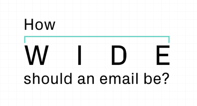
It's one of the most fundamental email design questions: How wide should your email be? Here's the answer.
If you're just here to find a quick answer, here it is: Most email designs today are between 600px and 700px wide. You no longer have to stick to a maximum width of 600px, as many outdated resources still suggest. Instead, pick a width that works with your design and the complexities of your layout.
In this video, we break down the most popular email widths.
Are you up for a bit more of a deep dive into the world of email widths to find the optimal width for your email template? Awesome! Let's dive right in.
When you're designing an email, the width attribute specifies how wide an HTML element — in this case the div or table containing all your email content — can stretch. On the most basic level, the email width dictates how wide the canvas is that you can fill with content. The ideal email width gives your design enough breathing room, renders across clients, and allows you to work with the amount of columns that you'd like to display.
For a really long time, 600px was the gold standard of email width. Why? For a long time, most emails were read on desktop devices, with email clients like Outlook, Yahoo! Mail and Hotmail being among the most popular reading environments. If we go back about ten to fifteen years, most desktop screens hovered around a resolution of 1024x768 pixels, and the most popular email clients provided viewports that were about 600px wide. For emails to display properly and without horizontal scrolling, email designers wanted their emails to match that viewport width. That's why it used to be important to stick to a maximum email width of 600px.
Over the last few years though, a lot has changed. If you're reading emails on a computer, you might be looking at a screen with a 1920x1080 resolution. Reading your emails on an iPhone 11 Pro Max? That's 1242x2688 pixels available to make your emails shine. Low screen resolutions should no longer restrict your email design width — and email clients are no longer limited to 600px view ports either.
It's also time to bust another myth that keeps being repeated: You might see resources recommending that your email shouldn't be wider than 640px because Gmail would not display background colours if your email stretches beyond that. That too is no longer true. Today, Gmail displays background colours beautifully, no matter how wide your email (or your browser window) is.
Today, we see many email designers venture beyond 600px to give their email designs just a little more space. Most emails fall somewhere between 600px and 700px though.
What exactly the best width is depends on what you're planning to do with your design. Especially when you're working with multi-column layouts, picking an email width that supports your column count is crucial.
The perfect email width doesn't exist — it all depends on what exactly you're trying to do with your email design.
Tweet this →
Let's say you're looking to build a template that features three columns. You'll want to pick an email width that divides evenly by three. A 600px email, for example, can be evenly divided into three columns at 200px each. If your email was 620px wide though, you'd be in trouble: 620px divided by three makes 206.67px — but there's no such thing as a .67 pixel. Because you have to work with full pixels, you'd have to make one column slightly larger as the others — and that makes designing your email a whole lot more complex. That's why the question of how many columns you'd like to support is one of the most important considerations when settling on your email template width.
There are two choices for email width that have grown increasingly popular with email designers who're moving beyond 600px:
You don't have to stick to these common widths though. Think about your email layout and your column structure first — and then pick an email width that makes it easy to support your design goals.
Curious how fellow email designers work with custom widths that go beyond 600px? Let's look at a few examples!
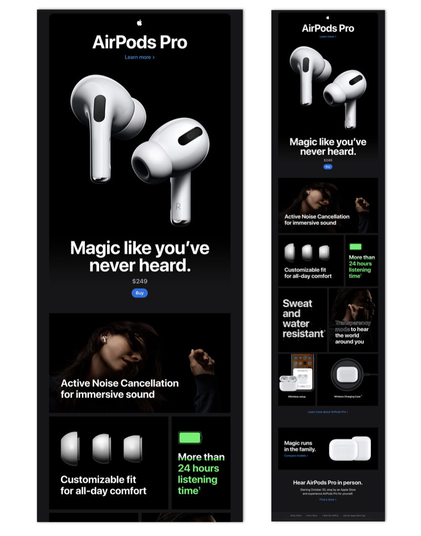
This email from Apple that's promoting their AirPods is 712px wide. This makes it work nicely when viewed on large screens, but it's also set up to scale down nicely when viewed on smaller devices.
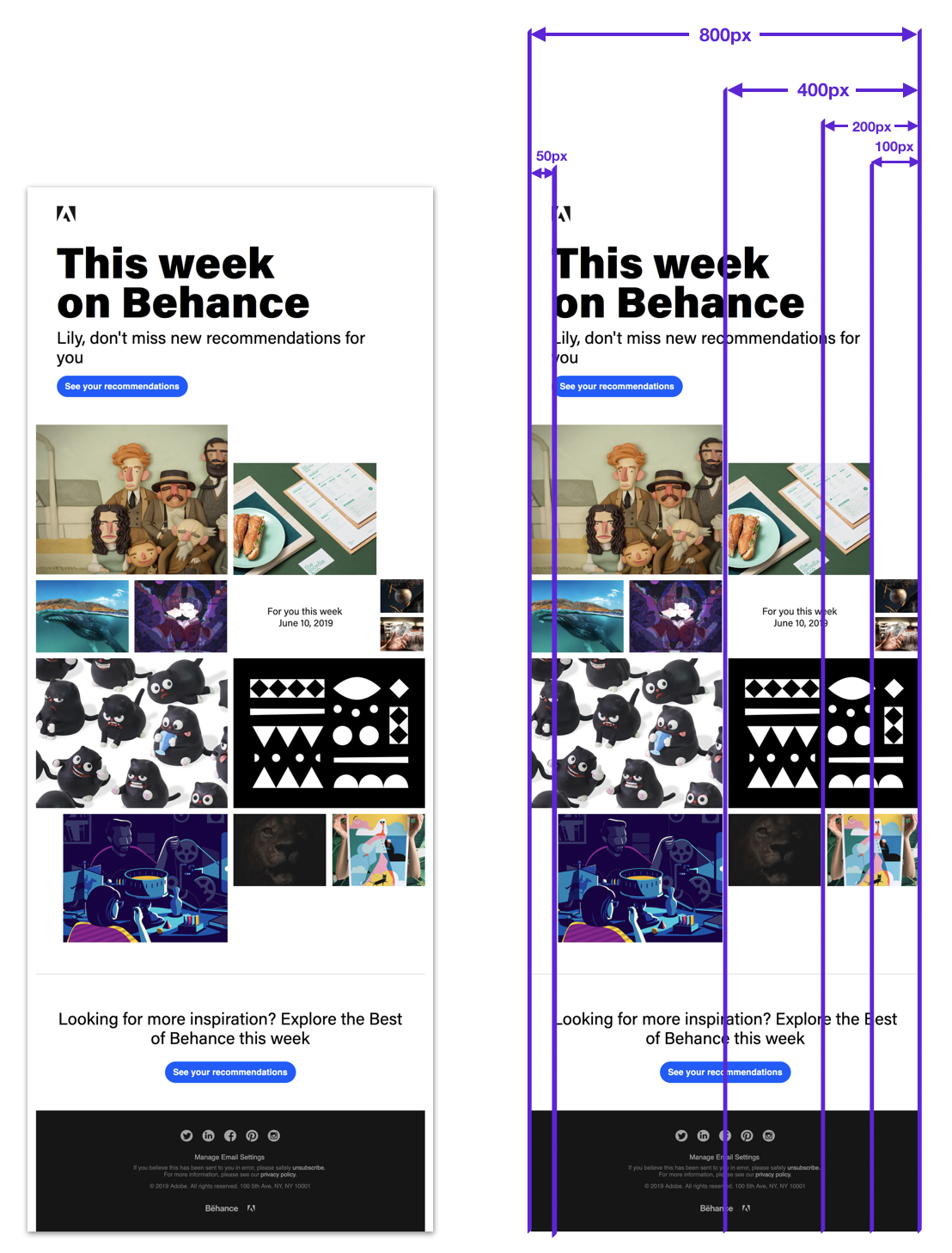
This beautiful email by Behance scales to a maximum width of 800 pixels. To power its asymmetrical look, the designers break up the 800px email width into a grid of 16 columns at 50 pixels each. A layout this complex would be close to impossible to do with a smaller width.
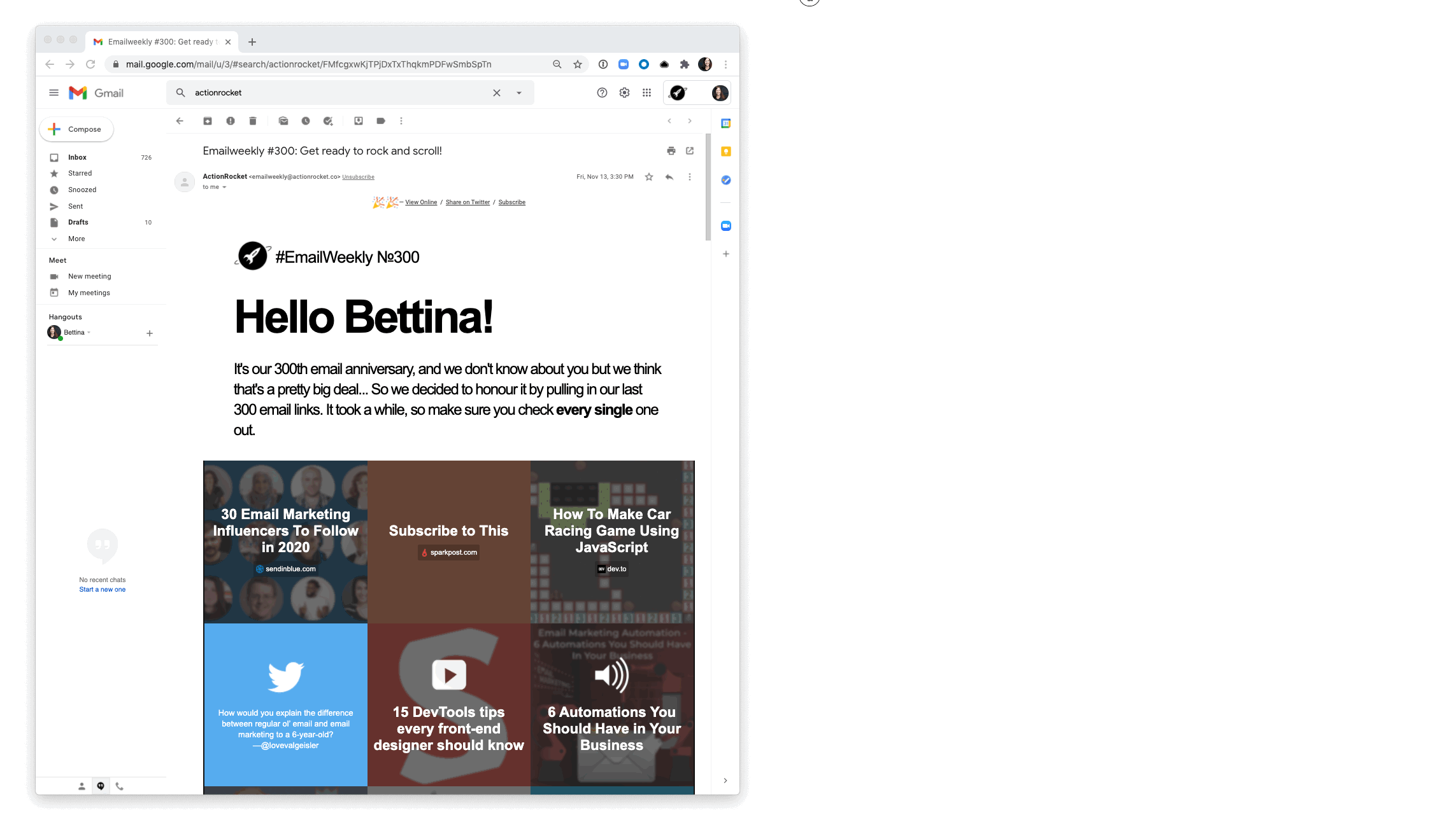
ActionRocket's weekly roundup of email news maxes out at 1600px wide, but has several break points so that the layout works down to around 300px width. The risk of having sentences appear too wide (the Measure, aka amount of words per line) is mitigated by using multiple columns, and large font sizes. Most of the article content items are squares, and up to 5 appear on one line, but each square is only ever shown as a max 320px wide.
___________________
In this webinar with our friends at Really Good Emails and Mailchimp we look at some of the basic design principles that make for a good email design. You'll learn the fundamentals of layout and color use — and why it's a great idea to keep things simple.

Taxi helps marketing teams make better quality email, quicker, at a larger scale.

