You've created your ideal Email Design System, now here's how Taxi unlocks its potential for your users.

Having a well-designed editing experience that is tailored to the needs of your users is crucial to getting the most out of your Email Design System. Getting this right means that your team can create email more quickly, more confidently and with less risk of error.

We've previously outlined some ideas to consider to create a great user editing experience in Part 1 of this mini-series, but let's quickly sum up the larger points here:

  • It's about building a world where everyone can work and collaborate in - giving confidence to those that may be newer to building email, providing enough depth and creativity to those that are more skilled, and helping all work together no matter their level of skill.
  • The editing experience needs to be easy to understand and intuitive to use, be designed so that mistakes are prevented, and that your intent as a designer is communicated through how it can/can't be used. This should transform your workflow - making it smoother, quicker and more productive.
  • When designing the user experience, consider who will be using your Email Design System (in terms of skill level), how they will interact it, and what they will be trying to achieve strategically. A great idea would be to regularly communicate with, and get feedback from, the users - so you can model the experience around their needs and make sure to solve the problems they are facing.

In this article we will look at how Taxi can help you achieve this. Firstly - let's have a look at what you would use to create this editing experience - our powerful Taxi Syntax.

Taxi Syntax hands you full control over your Email Design System

In simple terms, it's code that instructs our editor what to do with your carefully designed Email Design System HTML, through a series of tags and attributes.
drag-module.gif#asset:2410

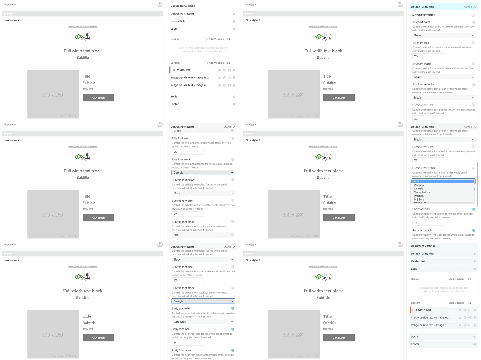
This is the result - your powerful and expertly-designed Email Design System is harnessed into an intuitive and easy-to-use editor.

You use it to create the editing experience for your users, and you are in full control of this. You decide what can, and can't be seen and edited by your users. And whatever you decide is replicated to give your users a straightforward editing experience.

Taxi doesn't touch your Email Design System's HTML

You can add Taxi Syntax to your HTML to define exactly how people can create and edit your emails, and we don't add code to your HTML.

And once the email has finished being edited and is exported to your ESP, the Taxi Syntax falls away upon exporting. You are then left with a cleanly coded email ready to go. Giving you a customisable and intricate email editing experience without meddling with the HTML that your subscribers receive.

So what can you do with Taxi Syntax to create the best editing experience?

A world of possibilities awaits you with Taxi Syntax. As we've touched on before in this series, different teams with different skill sets will be wanting to use your Email Design System in various ways. Taxi Syntax enables you to really cater to everyone's needs whilst retaining the editing experience you set out to provide. No compromising and all inclusive. 

Let's see what you can set up:
  • Expectations - Set rules and best practices for how your emails should be built, and Taxi will ensure that they are followed in the editor. Taxi warns you multiple times when you try to export whilst an Expectation hasn't been met. No more mistakes such as uploading an image in the wrong format or leaving text fields empty.
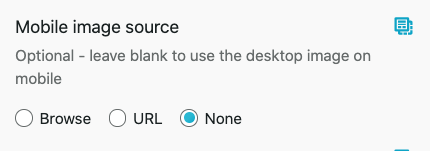
  • Hints - You can include tips and hints with modules and fields to help guide users through any rules that you have set. For example, if there is a single dropdown that controls the background colour, text colour and CTA style of a module, you could have a hint that explains this.

Can you spot the hint? Some clear and helpful guidance for your users.
  • Layouts - If you send multiple types of email, you can create Layouts using the structure and formatting for each type. This means instead of building each email from scratch, you can select the Layout and all the structure, copy and formatting is ready for you to add content to. 
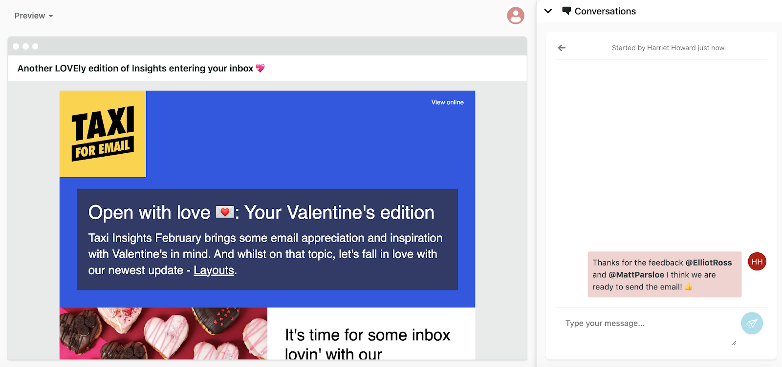
  • Conversations - Taxi enables you to start chat-based threads around any area of your email. You can leave comments, tag team members and discuss things like suggestions and changes - all in real time and linked to a specific area of the email. This can be especially useful for noticing Email Design System feedback- such as seeing lots of Conversations about copy being too long in a certain, regularly used module.


Hiding of fields based on other fields - You can configure the editor to hide certain fields depending on how other fields have been used. For example, a field for a product sale will not be available unless a sales banner field has been used. 
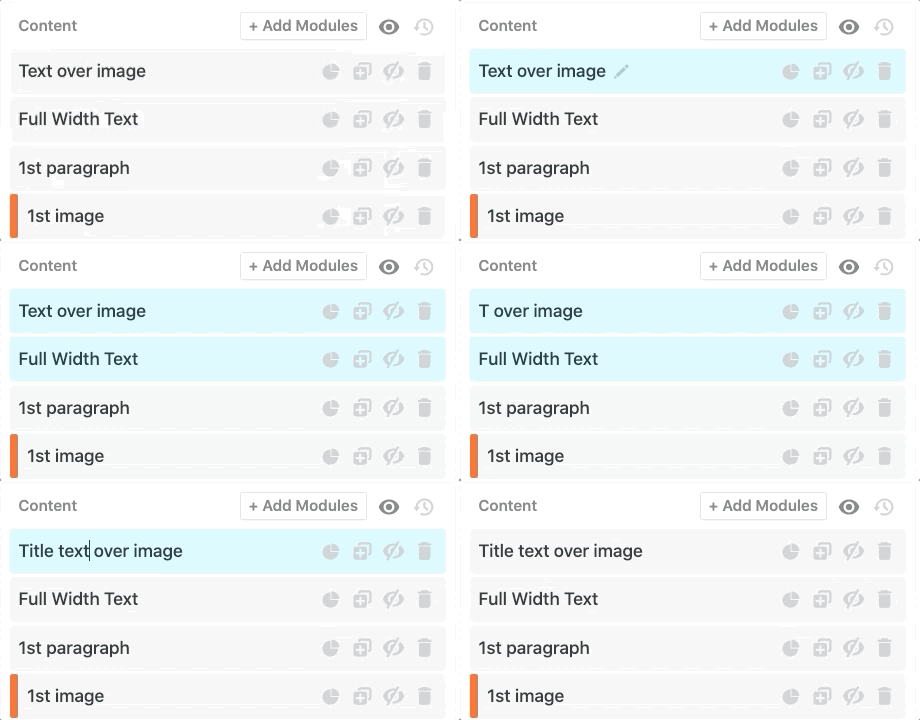
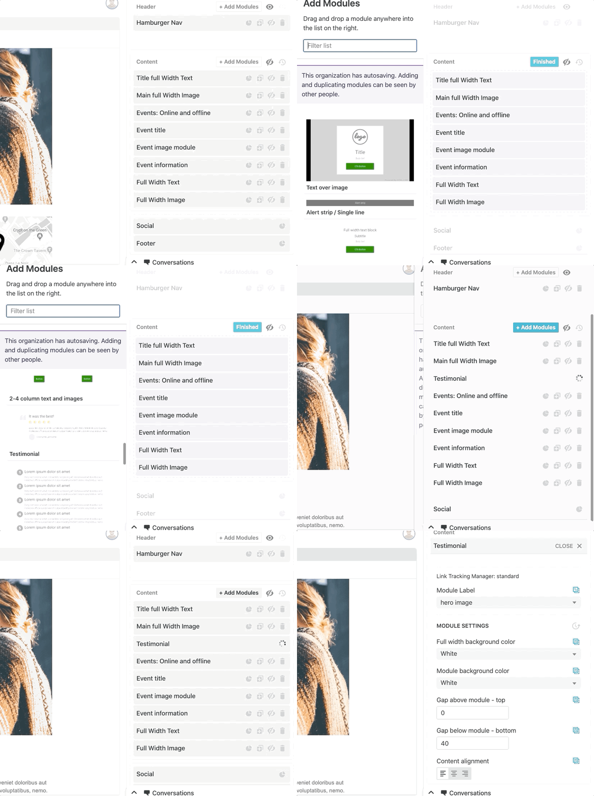
  • Intuitive naming for a module's purpose - You can rename modules so that they describe their purpose, rather than their placement. For example, an 'image left' module could be more focused, like 'main product highlight'. You can see this in action below:


  • Template guide - You can upload a PDF guide along with your Email Design System to enable those creating your emails to reference it when wanting to view any information about your Email Design System (that you want to be available). This helps communicate your intent and provide them with everything they need, reducing the reliance on you throughout the email creation process. Find out how to upload one.
  • Changing the same variable multiple times with one action - You can make it so your users can quickly make changes to multiple areas of your email in one click. For example, if you want to change every module's background colour to be the same for all, you can provide an option (a dropdown, colour picker - your choice of field!) to do so. 


  • Changing lots of different aspects with one action - You can use Taxi Syntax to show multi-value dropdowns where you wish to achieve this. For example, you can provide your users with the ability to change the background colour, text colour and CTA design to previously set designs (e.g white background, black text, red circle CTA - or- black background, white text and blue square CTA). you can find out more in this video.
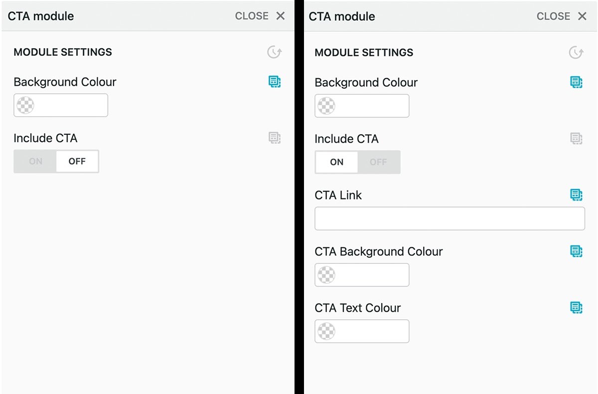
  • Dictate what is and isn't editable - Open up and lock-down individual modules to ensure that those making email are editing the right areas and not making branding errors by changing set designs such as banner modules or navigation bars. And if you wish to hide certain fields that are based on actions in other fields, you can nest them to make the editor clean and easy to follow. For example, you may have an option to include a CTA button. When this is turned on, the rest of the options for this CTA button (colour, font etc) appear also.

See how, when the CTA is switched on (right hand side), more options appear!

  • Pre-code complicated areas. These usually come with a high risk of error if done manually (i.e. adding a background image for Outlook). If the complex coding is already done, users can include these easily and risk-free. 

There is lots of advice for you on our code page if you want to get started with building an Email Design System.

If you want to know more about how Taxi can be the link between your users and your Email Design System's potential, then get in touch with us - we'd love to show you what Taxi can do!


See how Taxi can help your team

Taxi helps marketing teams make better quality email, quicker, at a larger scale.

Let's set up a conversation→


44,916 email campaigns and counting.

Join the smart marketers using Taxi to make better email.