

Email Marketing
What makes a good subject line?
Subject lines are an important part of your email, so here's how to not mess them up.
Read More →
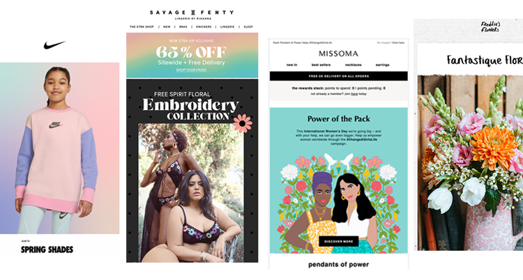
These emails made us so excited for Spring, with floral and pastel tones entering our inbox from some big names including Missoma, Nike and Freddie's Flowers.
As we are now entering sunnier, warmer times, we are turning our attention to emails that focus on floral and pastel themes. They really put a 'spring' in our step!
We asked our team to share their favourite floral and pastel toned emails, we hope you love them as much as we do.
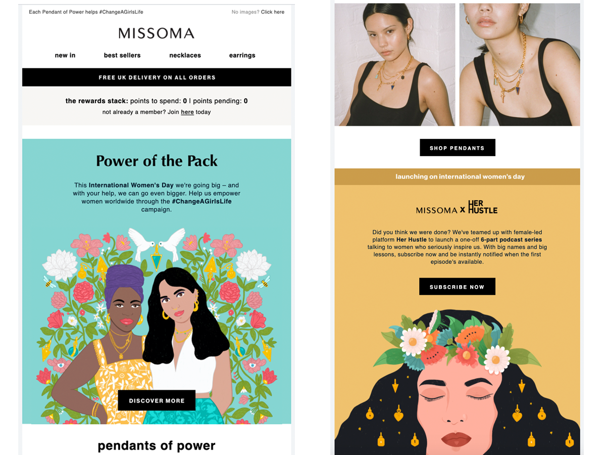
Missoma, a well known jewellery brand brought some beautiful illustrations and colour to their emails this month to celebrate International Women's Day. Their illustrations may have brought their email to life but their message was equally powerful. Alongside supporting young women through employment, poverty and training they launched a new line of jewellery.
The illustrations cleverly incorporate the brand's product lines, without making them the main focus. And let's not skim over their custom icons at the bottom of the email , giving it a unique feel.
Here is what Missoma do really well:
Savage x Fenty, a lingerie brand designed by Rihanna, features their floral embroidered collection in their most recent email campaign. The email is about 70% image based (even a lot of the fonts are images), which could be slightly problematic for rendering, but looks awesome when viewing online. Litmus created a really helpful guide on fonts for email you can check out if you currently use images!
Fenty use a flower print design between white space areas, which works well to separate the heavy black lingerie shots and background colour. This helps give the email colour where the product is dark.
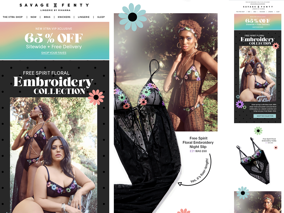
Here are a few things Savage x Fenty do well:
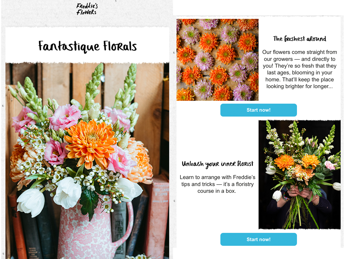
UK-based flower subscription service Freddie's Flowers feature their latest bouquet in their emails. They have some lovely imagery that shows off their products but what they do really well is use a GIF to show how easy it is to purchase their subscription flowers. The email really pops with the bright, vibrant flower product shots to celebrate spring, mixed with the colourful pots or black backdrops - they make an effort to help you envision the flowers in your home.
Where email can be slightly tricky when it comes to rendering custom fonts, Fredddie's Flowers uses images to help display them asthey do on their webite. Some particularly great pictures are different product shots that show off the same bouquet, but in a way way which makes the flowers look different in each shot.
Patch Plants is an online plant delivery service which has been tried and approved by lots of the team at Taxi! But is another example of a simple email which works well. As an online retailer, their emails mean a lot when it comes to showing off the value of the product. Everything in this email is thought out from the two CTA options under each plant shot to either buy the plant or buy the pot to the charity pot at the bottom.
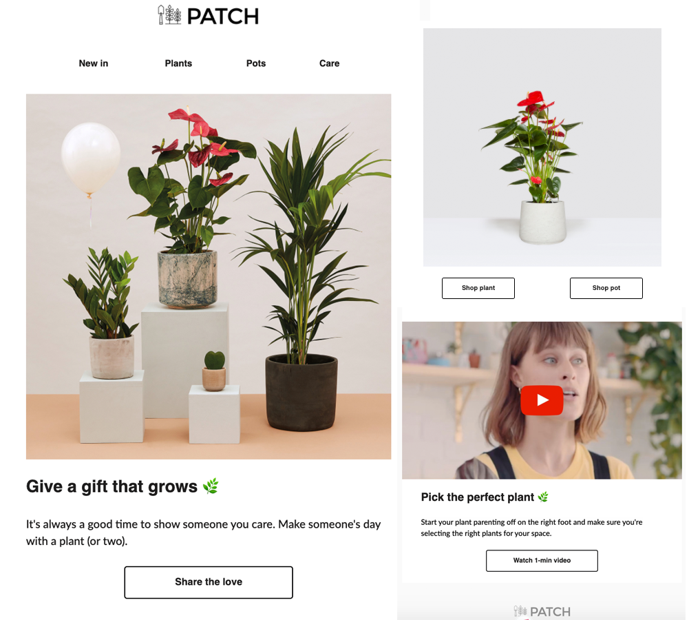
Here are a few things they do well:
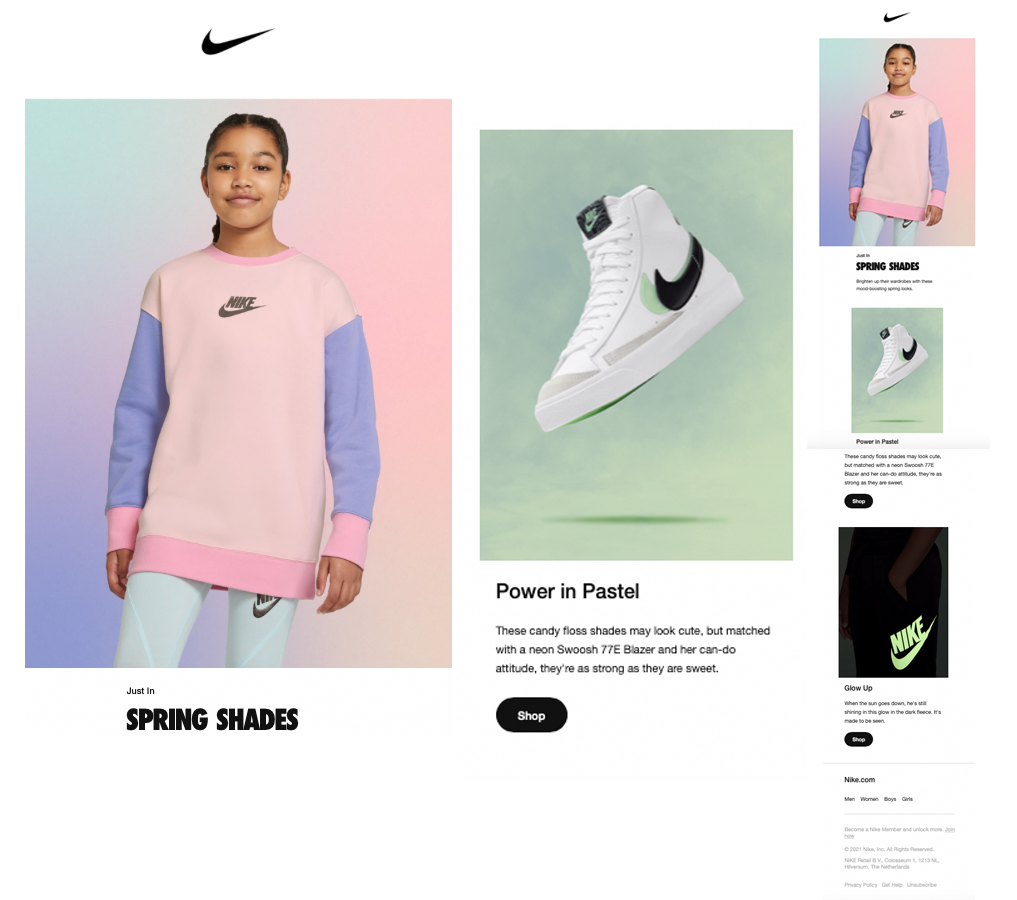
Sportswear brand Nike launched their spring range for Kids this month featuring ombre backgrounds and candyfloss pink tones. All their products were vibrant colours which they nicely shot onto ombre backgrounds of pastel colours - which in your head might not work but it looks really good in the email. Plus, it looked great in mobile view!
Nike usually send short emails, with a few product shots so that as a reader you aren't overwhelmed. What they do really well here is use GIFs instead of multiple images, so you still get to see different products without needing to scroll through the email.
Did you spot any emails you particularly enjoyed? Share them with us on Twitter or send us an email — we'd love to see them and add them to this post.
Taxi helps marketing teams make better quality email, quicker, at a larger scale.

