

Email Marketing
What makes a good subject line?
Subject lines are an important part of your email, so here's how to not mess them up.
Read More →
Put emphasis on key copy elements and give your email designs a little special something with text highlight effects. Here's how.
As an email designer, you've got multiple tools in your typography toolkit to help you put emphasis on key copy elements. You can adjust the colour and font size of certain text elements to adjust their visual hierarchy and apply styles like italics or bold text to make certain bits of copy stand out.
There's one technique though that's rarely used—even though it's simple and powerful: text highlighting.
Using a highlight effect on key elements of copy, whether that's headlines, subheaders, CTAs, or other key bits on information, can help draw your subscribers' eyes to the most important content in your email. Plus, if it's done well, it can be a truly unique design element that will make your emails stand out in the inbox.
Curious what that could look like? Let's dive into a few examples.
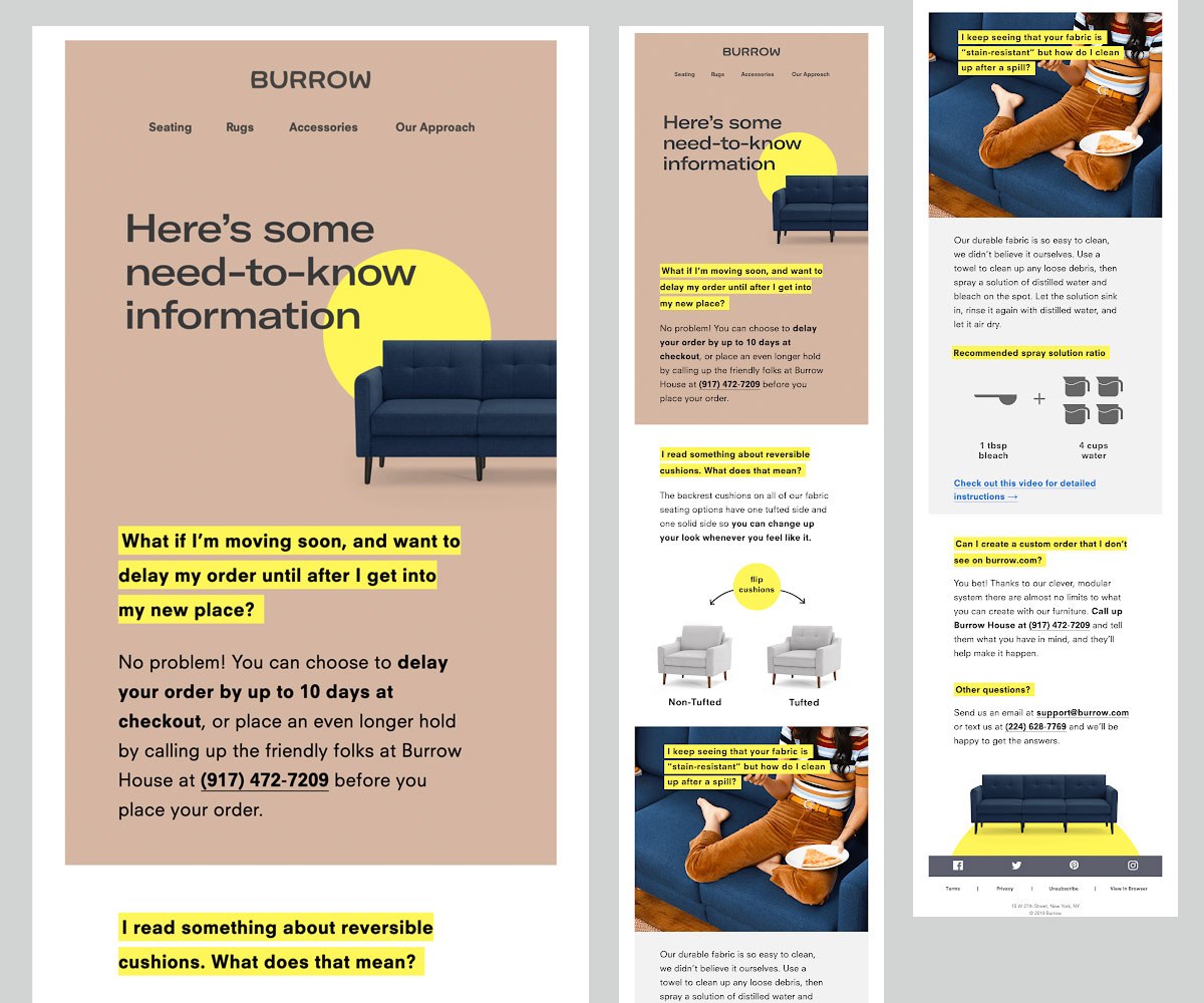
Check out this beautiful email by Burrow. The designers at Burrow use a bright yellow highlight effect to put their headlines in the spotlight. It makes the headlines stand out and helps structure the content in a way that makes it easy for the reader to skim.
Source: Really Good Emails
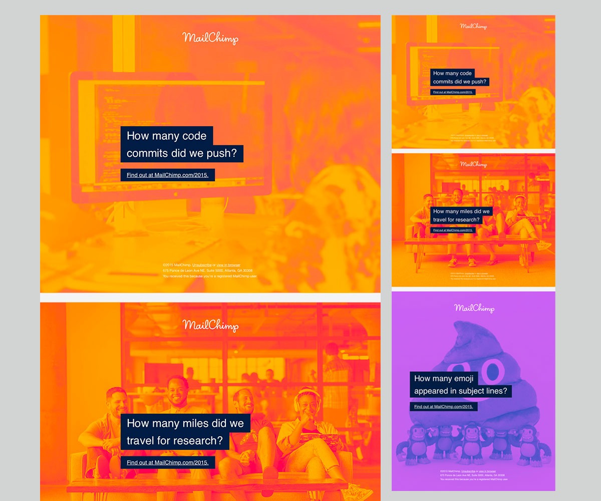
This email from the folks at Mailchimp is another stunning example of the powerful use of highlighted text. Here, the white copy is placed on a black background to make it stand out from the bright-colored background images. It's simple—and really beautiful.
Source: Really Good Emails
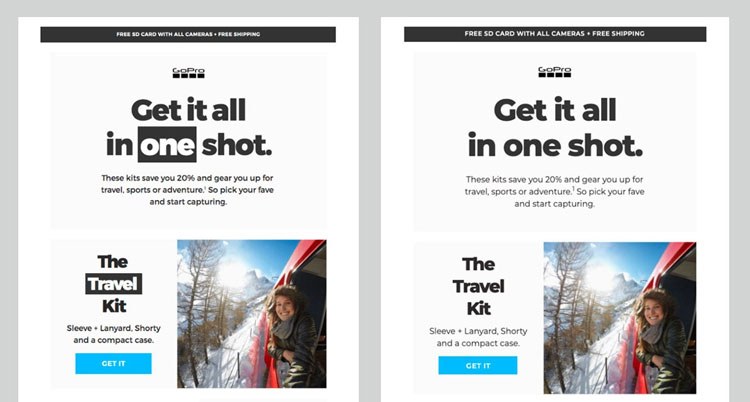
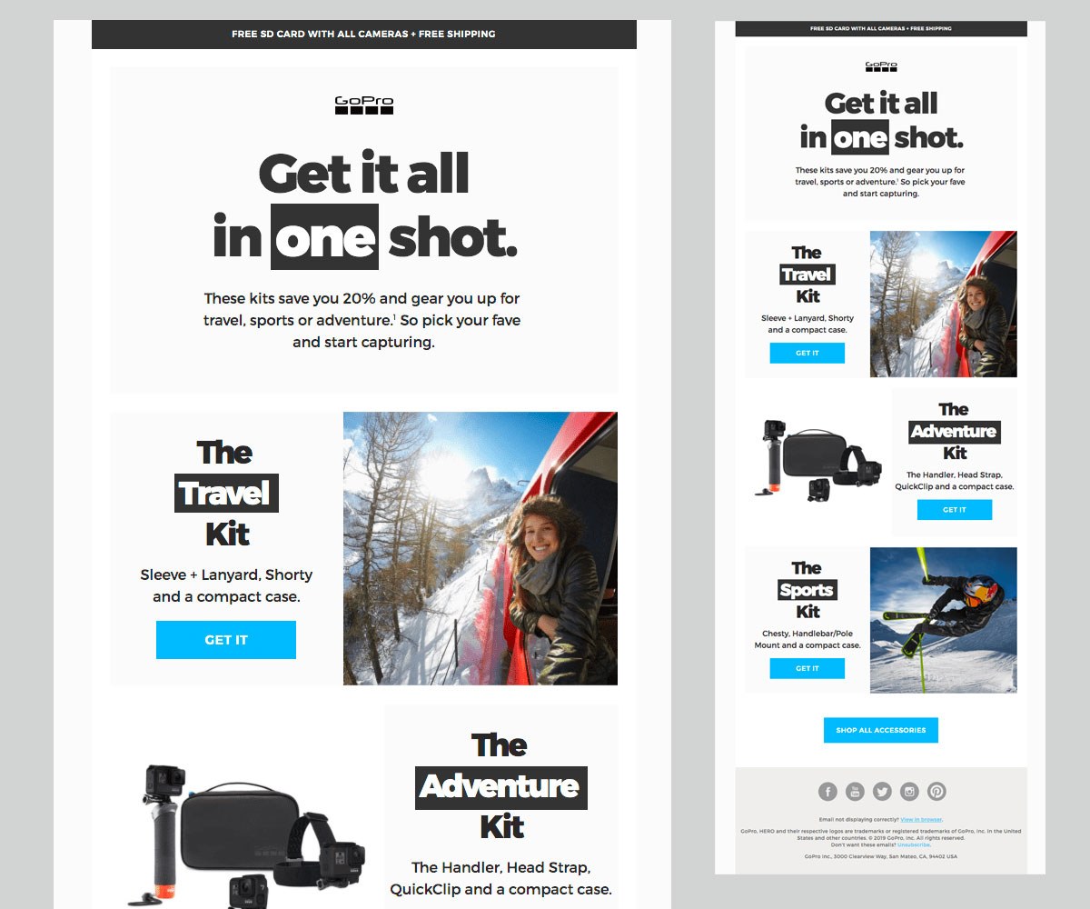
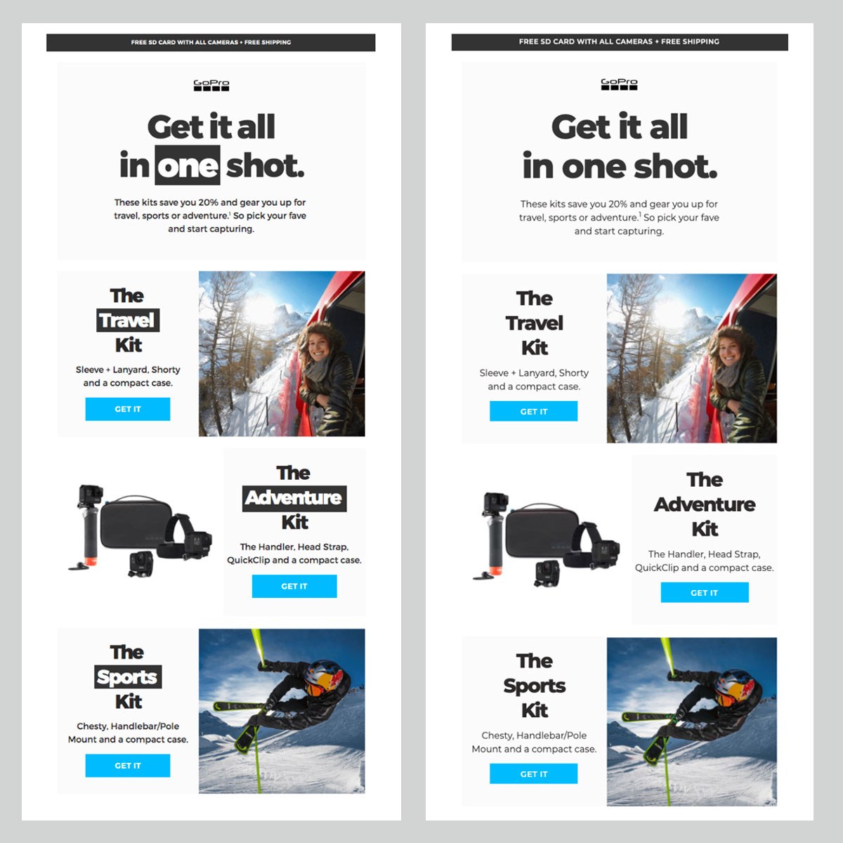
You don't have to highlight full sentences or headlines though. This email from GoPro uses text highlights to put emphasis on single words, swapping the color scheme from dark copy on a bright background to the exact opposite.
Source: Really Good Emails
It's a simple trick but it draws the subscriber's eye to the words that are so key to this campaign. If you just skim the email, what's the words that jump out to you? Travel, Adventure, Sports.
To show you how much of a difference this simple design element makes, check out the comparison below. It's the exact same email, but in the version on the right we've removed the highlight effect. It's still a good looking email—but it's the highlight effect on the headlines that makes this email truly special.
Are you inspired by these good-looking emails? Here's the good news: Implementing a highlight effect on your copy is really easy. All you need to do is add the background-color property to the copy you'd like to highlight.
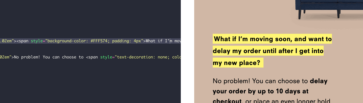
You can see how easy that is when you take a peek at Burrow's email code:
<span style="background-color: #FFF574; padding: 4px">What if I'm moving soon, and want to delay my order until after I get into my new place?</span>
You'll see that Burrow's email designers simply wrapped a span around the copy that they wanted to highlight, and then added a style attribute to set the background color for the selected copy to bright yellow. That's it. I told you it's easy!
You could achieve the same effect by using the background property but background-color shows better support across email clients, so we recommend using that.
To change the highlight color, simply swap out the color code. Plus, you can decide how bold you'd like your highlight effect to be by adjusting the padding like this:
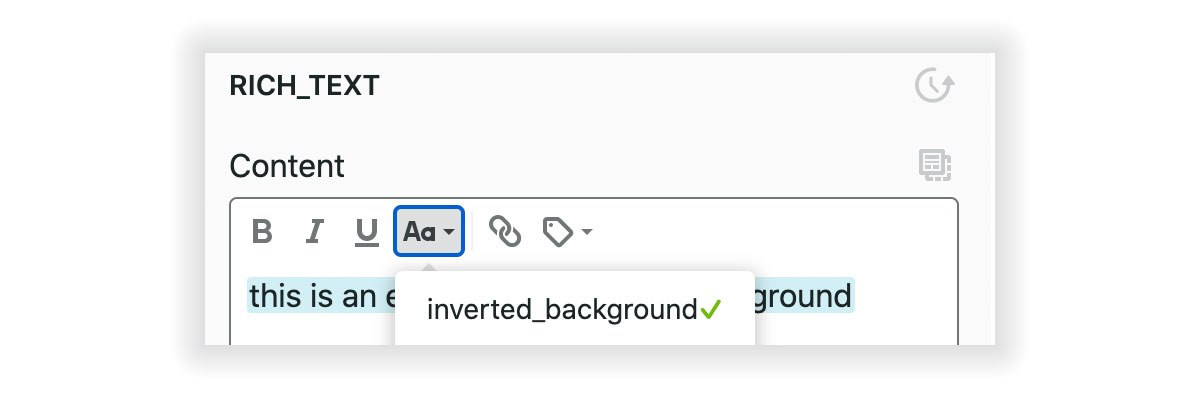
You'd like to give your team the option to add text highlight effects to their email in Taxi? Here's how to do that.
Let's assume you'd like to use text highlights to set up an inverted background effect like we've seen in the GoPro email above. To do that, you'll have to set up that styling—white copy on a dark background—as a rich style example. We'll name the style inverted background :
<editable name="text" rich> <span style="padding:0px 5px; background-color: #333333; color: #ffffff;" name="inverted_background" rich-style-example>one</span> </editable>
Once the rich style example is set up, you can easily apply the reverted background style to your email campaigns like this:
See how to get started with Taxi Syntax
Taxi helps marketing teams make better quality email, quicker, at a larger scale.

