

Email Marketing
What makes a good subject line?
Subject lines are an important part of your email, so here's how to not mess them up.
Read More →
Some awesome examples of companies who have nailed their transactional emails.
Transactional emails are one of the highest converting you can send, but they can be challenging for marketers - however, this doesn't mean you can't create awesome transactional emails for your customers.
Have you purchased something online recently? Then it's pretty likely you'll have received a transactional email within seconds of your purchase. Transactional emails most likely contain information the recipient wants to receive and are usually sent after an action has been triggered on a website or app. For example, a confirmation receipt after a purchase. By definition transactional emails are sent to people who are very engaged and can be amongst the highest performing a brand can send.
Here are a few examples of transactional emails you might send or might have received from a brand:
Transactional emails often generate a lot of value for brands (Merkle reported that 64% of customers consider transactional emails to be the most valuable messages in their inbox =1). It's a great way to bring people to your site or return them to make a purchase - especially as these emails are sent when the user is most engaged. Therefore, it's really important to not be intimidated by creating them.
Most transactional emails are triggered by customer activity, and they often need to pull in personalised data and dynamic content, for example purchase information, a newly generated confirmation code, or similar. That's why getting them set up is often more complex than creating your average promotional email. On top of that, there's additional challenges that tend to complicate the process of setting up and maintaining your transactional emails:
It's super important to keep your transactional emails up to date. Firstly, email clients often make changes to how they render email code. This needs to be QA'd regularly to ensure that the email your customers are receiving are being shown correctly.
Another important consideration is that links can often change as your website is updated, so making sure the links in your email still work is critical if you want your transactional emails to do their job.
Plus, with transactional emails being a crucial part of your subscribers' experience with your brand, it is crucial to ensure that those comply with your brand standards. Only when you review them regularly you can ensure that copy, design, and content is still on-brand.
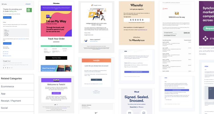
There are so many great examples of transactional emails on Really Good Emails you can take inspiration from. Here are a few we love:
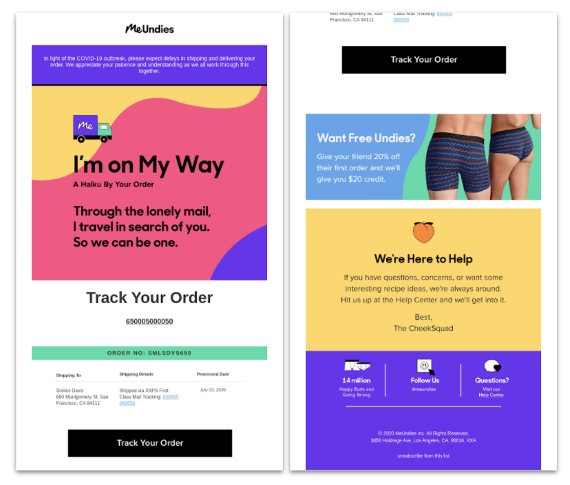
MeUndies do a great job of providing all the information a customer who has recently purchased a product wants to receive. A few good things to note are:
Forgetting your password is an easy mistake to make, but often it's when you want to make a quick purchase or sign in. Ensuring you get a password reset or login confirmation quickly is important. Whereby (via Really Good Emails) do this really nicely, with a clear, easy-to-paste login code added to the email. The email is really simple but serves its purpose - they also have provided an easy next step in case this code doesn't work. This means the user won't need to search for a support email elsewhere if they need help. And to top it off, it's all signed off by the Whereby team in their branded font, keeping it all consistent with their branding and reassuring the reader that it isn't a phishing attempt.
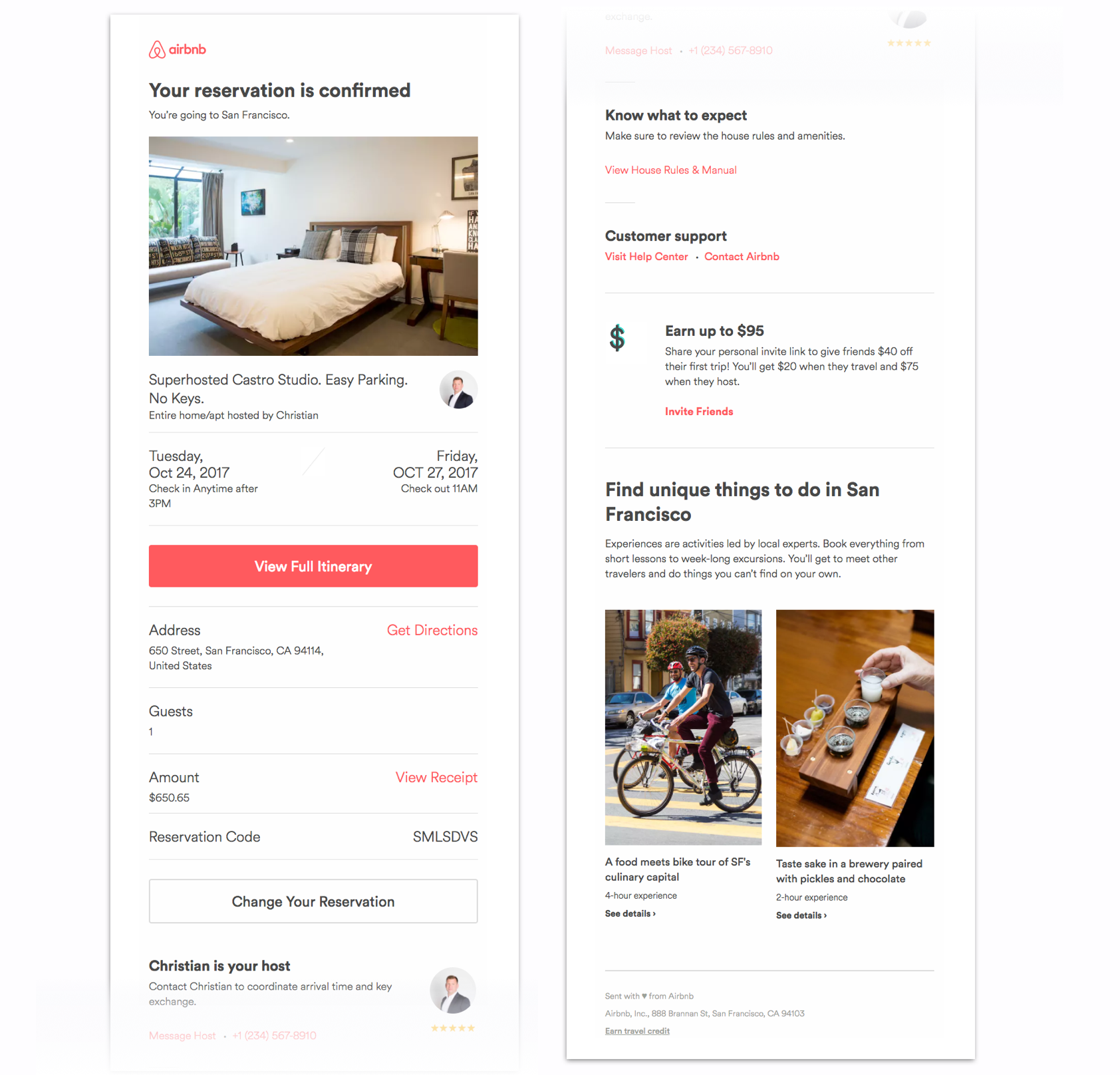
Shoutout to Airbnb (via Really Good Emails) for always creating on-brand, mobile responsive emails. Plus, they are one of our awesome customers so we are slightly biased! But here's a few things Airbnb do really well in this confirmation email:
Manage your Email Design System in Taxi and ensure that all your emails — whether it's promotional campaigns or transactional emails — are on brand. Plus, our intuitive email editor and personalisation features help everyone on your team to create and maintain error-free, great-looking emails, no HTML skills required. Get started using Taxi today!
Taxi helps marketing teams make better quality email, quicker, at a larger scale.

