

Email Marketing
What makes a good subject line?
Subject lines are an important part of your email, so here's how to not mess them up.
Read More →
Here are a few campaigns that stood out in our inbox this month.
We have searched high and low through our inboxes to find the email campaigns which really stand out, spark inspiration and make us excited! Here are our top emails we have been sent and why.
Want to join the conversation? Tweet us your favourite emails you have received this month and why you love them and we will make sure we subscribe to them (if we aren't already!)
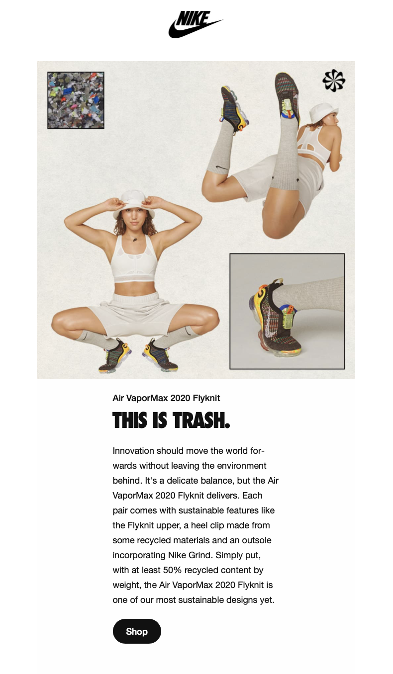
As a frequent buyer of Nike, I would consider myself quite invested in the brand. But what I love about their emails is that they are always switching their design up. This email reminds me of a magazine adopting an editorial style. Instead of focussing on the model/product they have a mood board style which features the product, shots of rubbish from where they got the ideas from and use a neutral background to bring everything to life.
They have also successfully segmented me based on my preferences - I am female so this product is relevant to me. I have also been looking at this trainer a lot, so I am not sure if this is just a coincidence but it would be really cool if it did pick up on that.
Likewise with a lot of their emails, the email tells a story from how the trainer was created and the inspiration behind it. With the caption "This is trash" it actually draws you in as a reader to become more engaged and interested behind the thought process of the product.
Possibly drawing the reader in to become more engaged and interested behind the thought process.
Another thing Nike have done this month is their touching tribute to Kobe Bryant, who would have celebrated his 42nd birthday this month. Nike's film "Better" commemorates Mamba mentality, which is narrated by Kendrick Lamar. You can watch the video here.
![]()
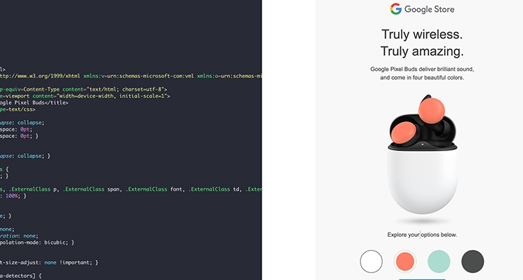
Google have released a pretty awesome interactive email to sell their new Google Pixel Buds. What I love is that you can actually interact with the email when reading it by swapping out the pixel colours, and this engagement in the email is what could push you towards buying the product or clicking through to the site. The way you can switch around the colours is mirroring a product website where you would be able to browse the product in different specs so this is almost hitting the user before they even have to click through - gaining interest and creating more impactful clicks.
The email is really slick and looks clean, I love the product shots to show the different ways to wear them with feature benefits added in a really digestible way. Instead of shouting at the reader they use softer language stating Truly wireless. Truly amazing which could actually entice the user more as it seems more genuine.
Take a look at their email here.
There's a lot to love about this email. They have got their branding just right, you can see the splash of yellow mirrored in the images, CTAs and text. They have done this in a way which looks splattered, or thrown on but there is clearly a lot of thought behind it. They also have adopted the use of text highlights to bring the reader's attention to that specific area.
To bring in a sense of the doc community, they have brought together quotes from their employees to tell a story on how they wear their Docs. Although there are clear CTAs and linked images throughout, it's only until you get about 3/4s the way down the email until they directly sell you the product, which I like.
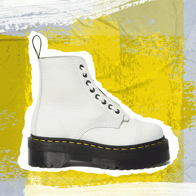
At the bottom they have created a GIF of the white Docs sitting behind a yellow background and the docs look like a piece of paper ripped from a magazine which is in line with their punk/rock branding of rough around the edges. Interestingly they added the GIF to the bottom which makes me think that they must get a lot of engagement in their emails for them to be confident to add it at the bottom where readers might not scroll.
This email reminds me a bit of the Spotify yearly digests - tracking your usage of their product and feeding it back to you.
I really like it because it's out of the blue, the data is collected from my app and made into this email which is pretty nifty data work, and also the intro copy makes it seem like by cycling I did something to help during covid, which is a nice feeling! Matt Parsloe, Content Marketer (Taxi for Email)
Another great touch here is the carbon emissions saved, which is something really cool for brands to start communicating back to their customers. Perhaps you have only cycled once or twice but little things like this can persuade you to start riding more often when you can track the impact you are having on the environment.
Take a look at their email here.
That's all for now, but let's continue spreading the marketing, and general, love! Saw any email in your inbox that you loved? Share them with us on Twitter!
Taxi helps marketing teams make better quality email, quicker, at a larger scale.

