

Email Marketing
What makes a good subject line?
Subject lines are an important part of your email, so here's how to not mess them up.
Read More →
Here are 5 creative email campaigns that stood out in our inboxes this month.
Every month we pull a list together of marketing campaigns which stood out to us. This month we decided to focus on great campaigns we have seen in our inbox - here's a few.
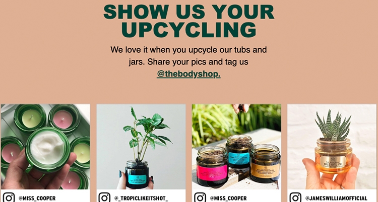
Combining multiple angles can lead to a confused message, especially when introducing any festive promotions. The Body Shop have conquered this however by introducing their promotional aspect (a discount code) right at the top of the email. They then concentrate the main messaging around a chosen ethical cause, before returning to more offers clearly separated in different modules further down.
They've focused on promoting an 'eco-friendly Christmas' to encourage their subscribers to be mindful about the environmental impact of the festive season. Not only is this a fantastic message, but asking their customers to upcycle their products and show them off via social media (which are then included in this email) is a great way to both interact with their customer community and also help promote this good cause. The design also helps reflect the tone and message. The green reminds the reader of the Christmas theme, as well as staying on brand for the Body Shop (a two-in-one!). The shade of brown reflects the recycling theme but doesn't disrupt the festive theme or the design. And the clear CTA's help direct the reader easily.
Continuing a theme of being mindful of waste in this round-up, London's favourite delivery pasta service Pasta Evangelists have their own idea in mind. They are focusing on the food waste of pumpkins after the Halloween festivities. Teaming up with FareShare and Waste Knot, they have created two recipes ready to order that contain pumpkin flesh, with →1 from each dish being donated to FareShare to help tackle food waste and world hunger.
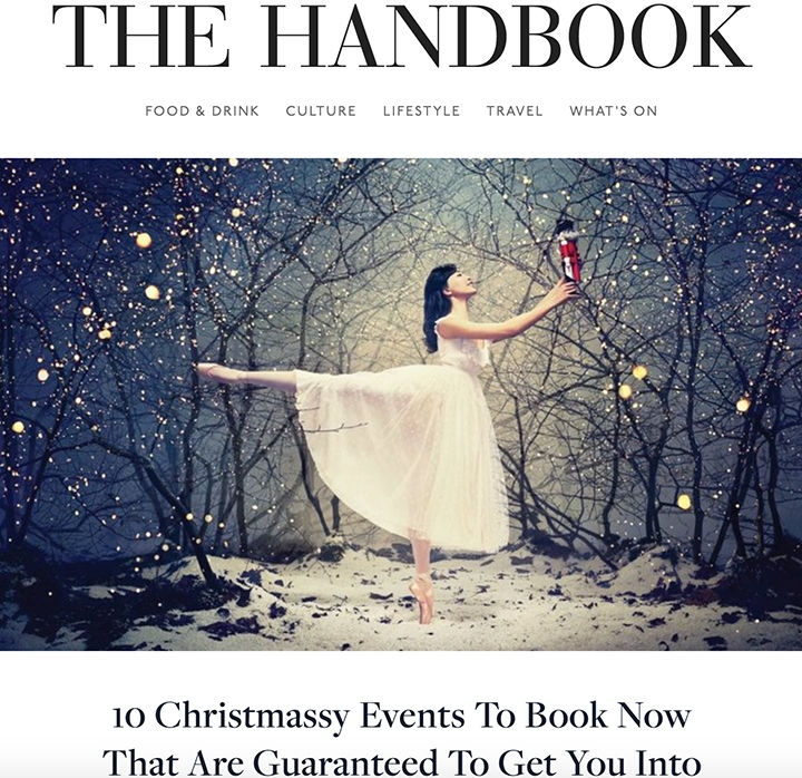
Design-wise, it's a simple email. But that lets the copy shine through. And highlighting and emboldening the key points within the copy helps these get noticed and hit home. Whilst I would've liked to have seen some 'free' suggestions on what to do with any pumpkins people are still holding onto, that doesn't take away from how much I like this email. Who said emails need to be sparkly and snazzy to be effective? Also, replacing 'Hi' with 'Ciao' for a pasta-based email is& Bellissimo!A newsletter-style email from The Handbook makes for lots of mixed content and longer reading times. Not that I'm complaining! The Handbook keeps it fresh with two techniques.
See the full email here
Its clean style and simple colour palette (black text, white background), as well as its editorial style, helps you navigate through the multitude of content without feeling overwhelmed or lost. And to help some of the content stand out, the flashy GIFs are a perfect injection of life to prevent the email feeling stale. Also, carefully choosing which images are GIFs and what each visual represents helps keep each module fresh and different to one another, without seeming repetitive or too dazzling.

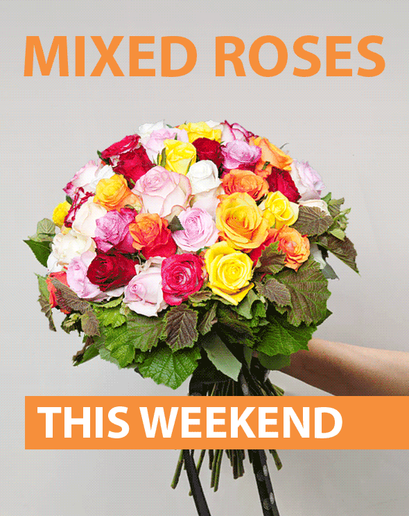
Another shoutout to GIFs, and a slightly personal one on this so perhaps some segmentation coming into play! Having recently shopped with Flower Station for some seasonal roses, I was pleasantly surprised to find this email in my inbox.
See the full email here
Offering their new seasonal offering of mixed roses (clearly based on my previous purchase), it immediately caught my attention thanks to it's flashy GIF. Ordinarily, GIFs tend to be included to catch attention and let the messaging carry the offer. However this time Flower Station let the GIF do both, which really helped keep my attention and definitely made me scroll down to read more!
Emails from your bank aren't usually the most exciting, or indeed the most understandable. Filled with financial jargon, legalese and basically no incentives, they tend to be difficult to absorb.
That being said, things are changing in the financial sector. For a while now, start-up 'challenger' banks that are more digitally tuned, like Starling, Monzo and Plum, are shaking up the traditional order. Their strengths lie in their digital savvy, and the digestible ways they communicate with their customers.
Starling is a slightly older challenger bank, and carefully balances its financial topics with a modern messaging style. Newer challenger banks, like Plum, can really lean into more millennial copy styles, including a vast array of emojis in practically every sentence that can seem off-putting. Starling's style and tone helps communicate a potentially tricky-to-explain product in a helpful and reassuring way. Expanding on the capabilities of their Marketplace feature, they easily take you through its new benefits without involving any technical or confusing language. A clear and early CTA helps click-throughs, and its clear design keeps the detail you need to extract from it from being cluttered.
That's all for now, but let's continue spreading the marketing, and general, love! Did you see any email campaigns in your inbox that you loved? Share them with us on Twitter!
Taxi helps marketing teams make better quality email, quicker, at a larger scale.

