

Email Marketing
What makes a good subject line?
Subject lines are an important part of your email, so here's how to not mess them up.
Read More →
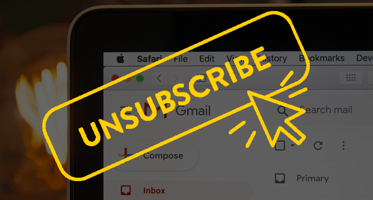
Do's and dont's for your unsubscribe process.
This January, I took the time to declutter my inbox by deleting and unsubscribing to what equated to 7,000 emails =1 And I would like to add a note that these were my unread emails, there were many more which ended up in my inbox bin!
I cleared so many emails from my inbox that it froze. As it slowly restarted, I started to think about what I liked and disliked about different brands' unsubscribe process. I also chatted to my team and some colleagues/friends to confirm my thoughts on this sometimes irritating process.
With this in mind, here are 5 things you could use to switch up your unsubscribe process:
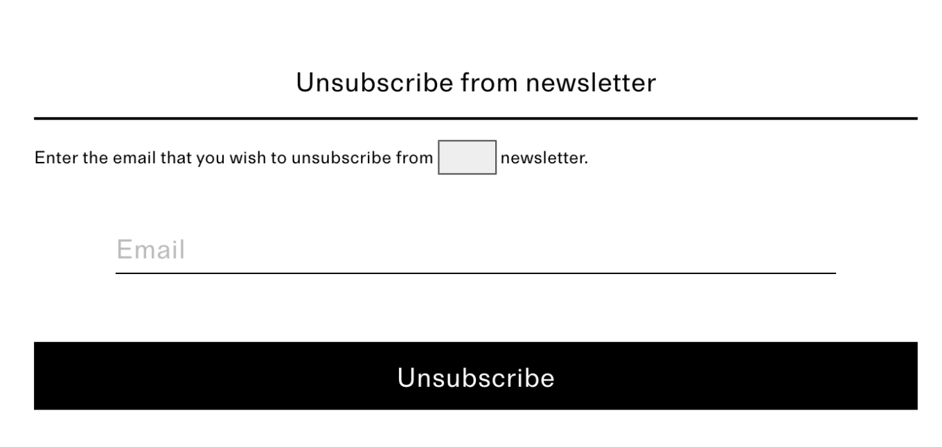
It's just an extra unnecessary step for the user - and can be quite annoying when unsubscribing from a mobile device.
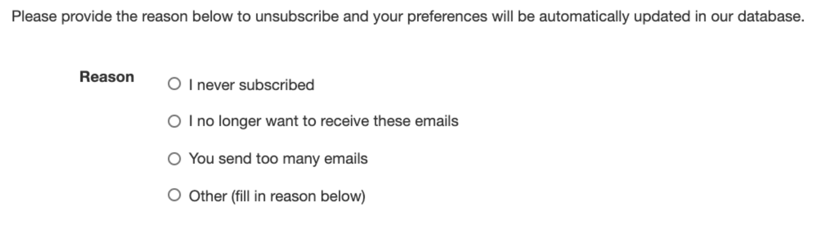
 2. Asking your customer to state why they are unsubscribing
Whilst it is important for brands to get insight into why their customers have unsubscribed, it shouldn't be compulsory in the unsubscribe process. Instead, offer them the chance to fill this out after unsubscribing.
I thought I had unsubscribed from a few emails, only to keep receiving them, purely because the buttons were switched around. Sneaky!
If you edit the text size for your unsubscribe links in your emails, it makes it difficult to find the unsubscribe link to begin with. The link needs to be accessible to all - I know for example my mum wouldn't be able to find the link for some of the emails I unsubscribed to.
The main purpose of unsubscribing is to remove that brand from your inbox, so as a customer who has intentionally stated I no longer want to receive emails from you, the landing page confirmation is enough.
What are your thoughts on the unsubscribe process? Any Do's and Don'ts you think are worth mentioning? Tweet us your unsubscribe ideas or annoyances.
Whilst there can be annoying aspects of the unsubscribe process, some brands really nail theirs. It is worth mentioning in advance that I will not be unsubscribing from these emails!
Here are my top 3:
One of my favourite emails to receive for obvious reasons, and they absolutely nail a few things in the unsubscribe process:
Whilst it is super important to know why subscribers have chosen to leave you, it also shouldn't be an obligation for customers to state why. Here's how Mob Kitchen do this well:
Another great example of a simple unsubscribe process. Here's a few ways they make the process easy to understand for the customer:
Taxi helps marketing teams make better quality email, quicker, at a larger scale.

