Email Marketing
What makes a good subject line?
Subject lines are an important part of your email, so here's how to not mess them up.
Read More →
Watch the webinar recording to get the guidance you need to implement an Email Design System that your team will love.
Email Design Systems are one of the most powerful tools to boost email production and improve brand consistency. But how can you implement one for your team?
In this webinar we heard from Crystal Ledesma (Manager Email Design Systems at Zillow), Matthew Smith (cofounder at Really Good Emails), and Elliot Ross (CEO at Taxi for Email) about the steps they have taken to implement Email Design Systems — and what mistakes you should avoid along the way.
A big thank you to everyone who offered a question during the webinar! Since we didn't have enough time to answer them all during the live session, we wanted to share them all here.
As a first step, find out why they're uncomfortable using it. Are they uncomfortable because email marketing is unfamiliar territory? Does the Email Design System not do what they want it to do? Or are they finding new tools hard to use?
In an ideal world, you'd involve all team members who build campaigns early in the process to understand their goals, pain points, and concerns. If your team can provide input into shaping the Email Design System and the new processes that come with it, getting buy-in is easy.
In general though, humans are creatures of habit, and it's normal that there's insecurity — and yes, sometimes resistance — when adopting new processes and tools. Taking the time for thoughtful onboarding can do wonders. Walk them through how to use the Email Design System (and whatever tools you use to manage it and create your emails), and make it easy for everyone to ask questions and give feedback about it along the way.
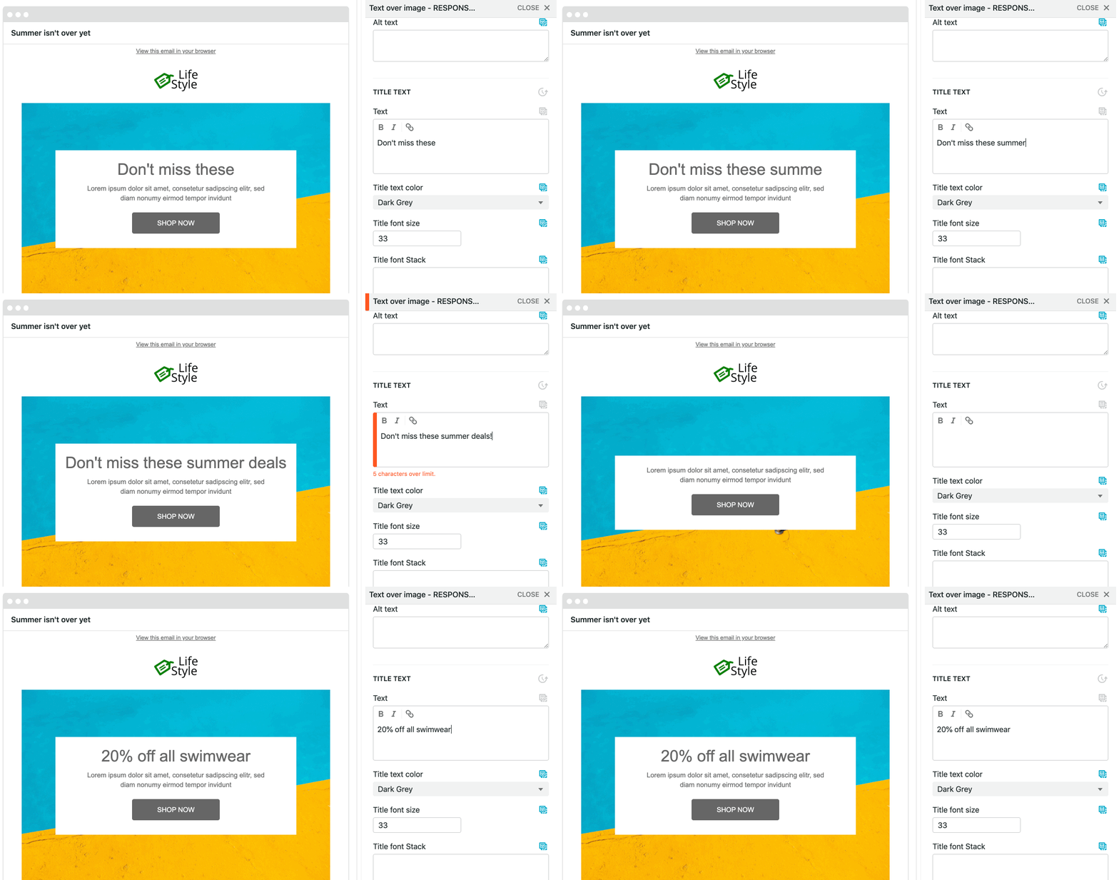
Yes, Taxi can do that! The beauty of Taxi Syntax is that you have the power to decide how your design can (and cannot) be edited — down to the details like setting character limits.
To prevent users from going beyond your character limits, you can use the copy-limit attribute. Simply find any rich text field that you'd like to apply a copy limit to, and specify the maximum character count allowed on that field. For example, if you'd like to set a character limit on a headline, it looks like this in Taxi Syntax:
<editable rich name="text" default="This is a headline" expect="copy-limit:50"></editable>
Once that's set up, your email creators will see a warning in the editor should they exceed a character limit, so they can tweak the copy right away — and they won't be able to export the mailing until the error is fixed.

The copy-limit attribute is just one of many powerful Expectation attributes that let you set the rules and best practices for how your emails should be built. You can learn more about Expectations here.
Crystal shared that as the manager of the Email Design System at Zillow she heavily relied on user interviews to better understand how teammates use the system, see where they're running into issues, and collect ideas for improvements. You can facilitate interviews either by opening up office hours or actively scheduling check-in calls with those who are using your Email Design System.
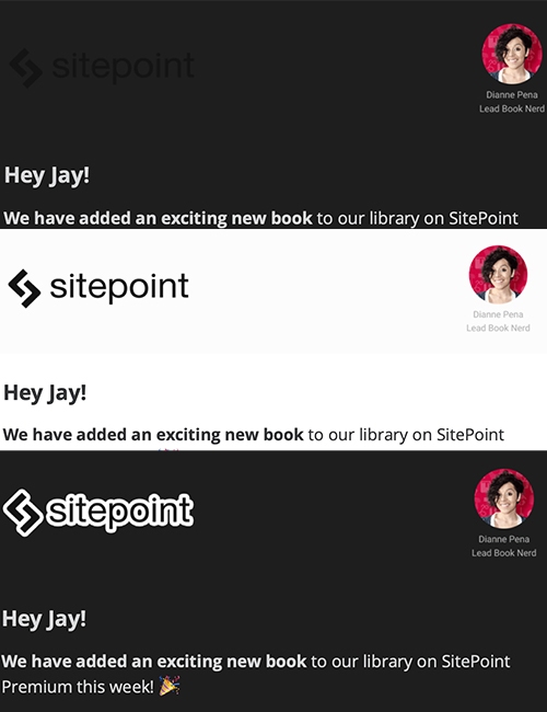
There's a few tweaks you can make to your code and your email designs to help your campaigns look great in Dark Mode. If you're using these tricks in your Email Design System, that means all emails created from it will be Dark-Mode optimised.
So what should you consider when creating an Email Design System that powers emails that look great in Dark Mode? Here's a few tips to get you started:

Here are more great resources and how you can get one off the ground:
Taxi helps marketing teams make better quality email, quicker, at a larger scale.