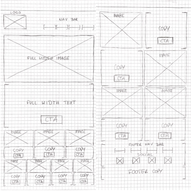
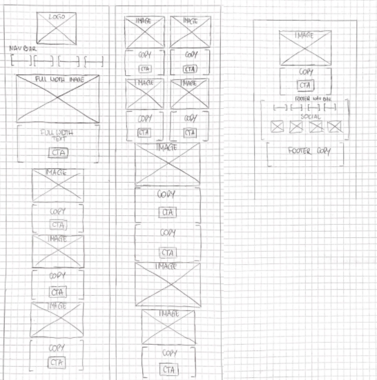
Your sketch, widely known as a wireframe, is a low-fidelity design that should include all elements you're going to include in your Email Design System.
Now that you have listed out what elements are to be included in your Email Design System, you can start to create a wireframe. By doing so, you will begin to see a low-fidelity visual of what your new template will look like.
This is a great way to purely focus on the design of the modules and elements you're going to include in your design, without getting distracted by colours or images.
The sketch can be created using a dedicated software or simply with paper and pencil. Regardless of what method you choose, you should be aiming to create something like the examples below:
Desktop:

Mobile:

Depending on your audience, it is not uncommon for a desktop to be a primary device. If so, don't forget that designing your Email Design System for mobile devices still plays a crucial role. Even if only one person opens your email on mobile, it is worth the effort to create their experience as positive as possible.
Once your wireframes are ready, make sure you take the opportunity to present them to your team in order to gather their feedback and make necessary adjustments before you start working on the detailed design.
Doing one or two rounds of amends is common practice during the design process, so adding time to accommodate making these adjustments to your project may be useful.
Next: Keeping your brand consistent across all email campaigns with your brand guidelines