There's no limit to what you can edit in your emails. Taxi Syntax enables your team to create campaigns in any way they need.
Fields are where people creating emails in Taxi are able to input content or values that control the content, layout and design of an email. For example, text fields to write in the copy, colour fields to choose the background colour and number fields to control font size. You can find out more about fields here.
There are various ways you can use these fields to make sure your email design system functions correctly for you.
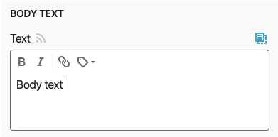
You can make your text fields rich text, meaning you can add specific styling to pieces of text such as bold, italics and links. You can have as many or as few as you need so make sure to think about what styling will be needed when creating emails. If you need more flexibility to add different styles, such as font-family or a strikethrough, you're also able to make these available.
You can have different styling options in different text fields, so if there are some modules that needed more choices than others, this is also possible.

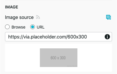
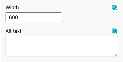
Image fields in Taxi enable you to upload an image from your desktop or input a url of an already hosted image. You can also include an option for the alt text of the image. Sometimes images don't load or are turned off when they land in the inbox, so alt text is very important for getting the message of your email across. It's also best practice to include it as this can have a positive impact on the accessibility of your email.
You'll also need to think about how the image dimensions are edited. If you're confident everyone using Taxi will be able to use the correct dimensions then you can include number fields to control the width and height of the image. Alternatively, if you wanted to lock it down, you don't have to make these options available in the Taxi editor and can have the dimensions hard coded in the HTML. If you choose to do so, the images that are uploaded will need to be the exact size specified, otherwise they may appear stretched.


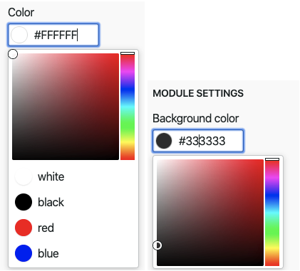
Colour fields generate a colour picker in the editor which allows you to pick any hex code you need. These colours can be applied to any part of your email, for example text colour, background colour or CTA colour. If you have specific brand colours you can use a dropdown to make sure you can only choose them and no off brand colours.
If you have specific brand colours, but sometimes there are custom colours throughout your emails, you can have the option for both. So there can be a dropdown for teams to choose from predefined colours, plus the option for custom hex codes if this is ever needed.

Just as you can have a dropdown of colours, if you want to guarantee that all of your emails will stay on brand, you can use this technique for any other part of your Design System. For example, a dropdown of numbers to specify the font size of your headlines or the amount of padding you have in between modules, or a dropdown of fonts to choose from.
This is a great way to make sure that no one is going to add in fonts they shouldn't or go off brand in any other way. It can also make the process of making emails far more streamlined and efficient. Having the option of any colour or any font size could be a little overwhelming, so giving predefined options to choose from will make it much easier to create emails efficiently.

As you can see, there are many ways to make your emails editable in Taxi, however it's also important to consider what you don't want editable. For example, if your emails always include your logo in the same place and with the same dimensions, it may make sense to hard code this so no one can edit it. Your team will have all the options they need to make great email without being overwhelmed with too much choice. As the Design System owner, you'll be sure that no one is editing something they shouldn't.