Email Marketing
What makes a good subject line?
Subject lines are an important part of your email, so here's how to not mess them up.
Read More →
See how brands use animated backgrounds to add movement and depth to their email designs—and learn how you can do the same.
In recent years, many brands have embraced the power of animation, utilizing animated GIFs as primary design elements to show off their products and tools, or to simply add some movement and fun to their campaigns. But animations don't always have to take the center stage in your email design. You can also use animations to spice up your background imagery, giving your email design more depth and a truly special look and feel.
In this post, we show you examples of brands that have mastered the art of animated backgrounds—and provide you detailed tips on how you can implement animated background images in your campaigns, too.
You can't quite picture how a background animation could look like? Let's check out some beautiful examples:
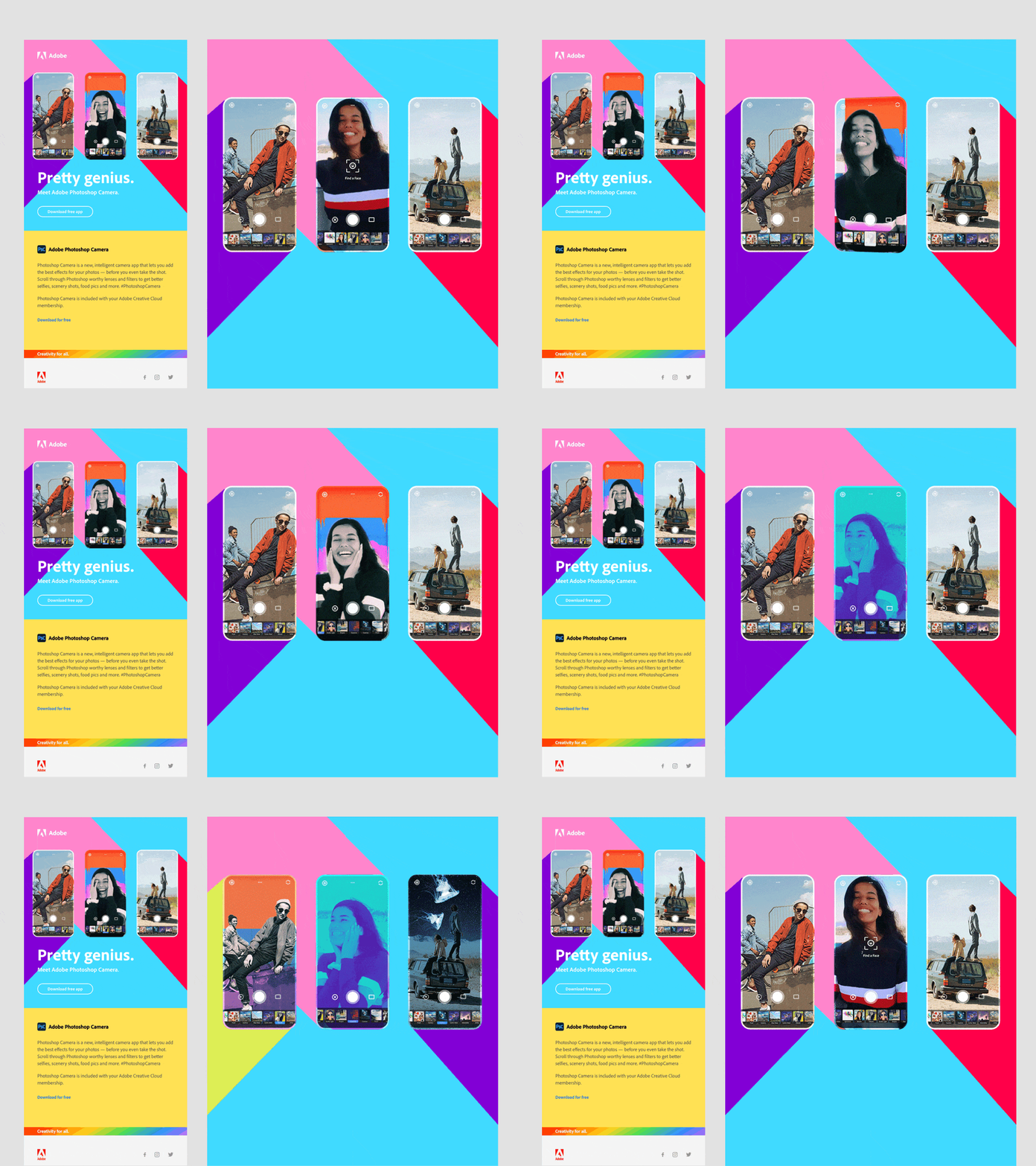
In this campaign, Adobe uses an animated GIF to show off its new Photoshop Camera app. At the center of this design is an animation that shows the app in action, but keep an eye on the colourful shapes in the background. You'll see that these change colors as well—swapping from red to purple and from purple to yellow—making this bright and colorful email design truly special.

Adobe's campaign — and the background image that powers it. See the full email.
If you peek at the email's code and how the imagery is set up, you'll see that the entire top area of the email contains one animated GIF that's set as a background image, and the logo, copy, and call-to-action are placed on top.
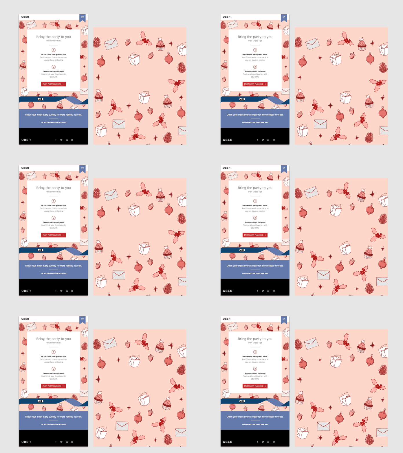
In this email, the design team at Uber is bringing their beautiful holiday-themed illustrations to life with animations. But rather than placing the animated illustrations at the center of the campaign—they could have easily created an animated GIF to be featured in the email header or to break up the content—they've decided to use them as a background image that frames the email copy and the CTA. The result: a beautiful campaign!

Uber's campaign — and the background image that powers it. See the full email in Really Good Emails.
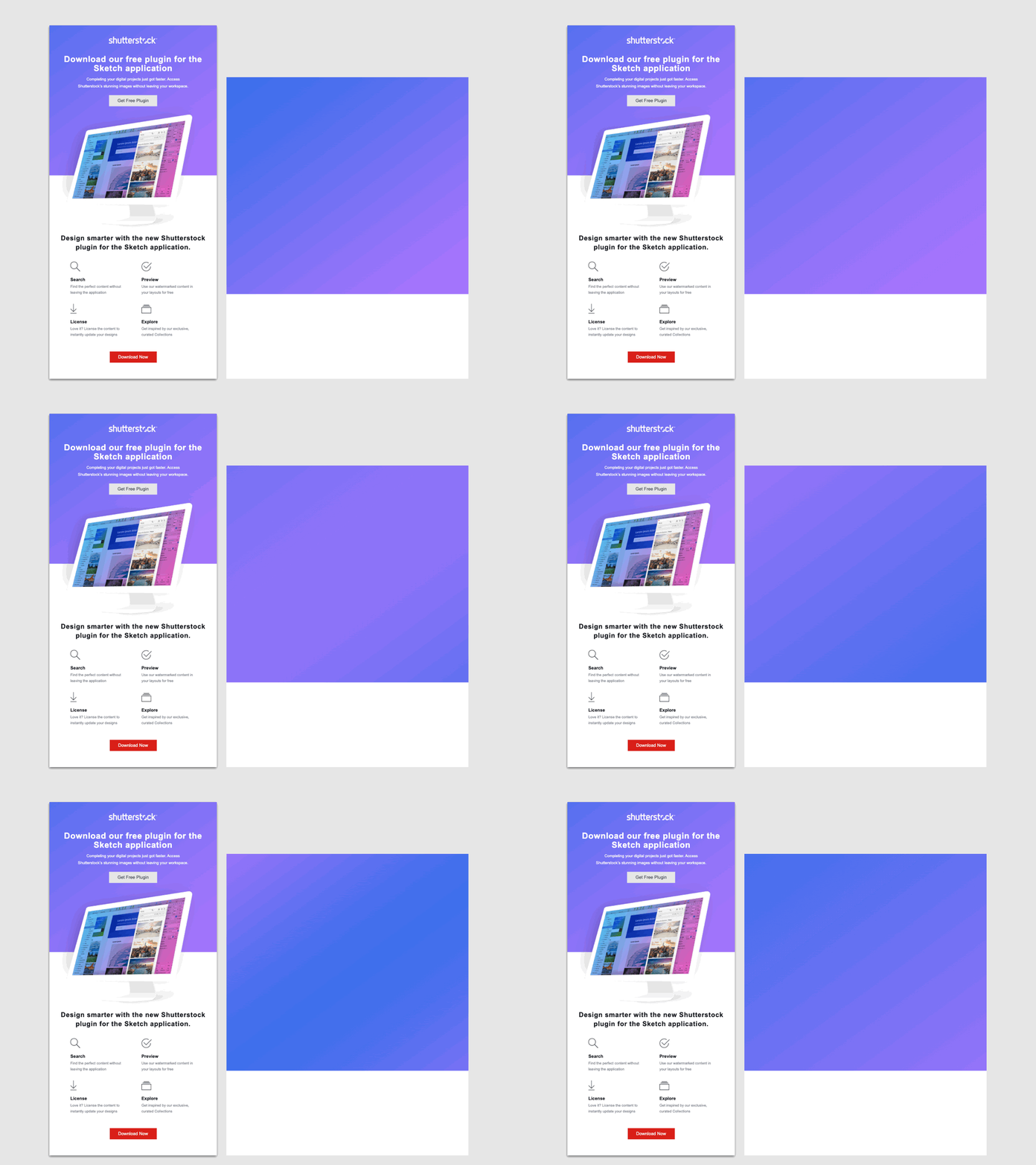
Background animation can also be really subtle—and still be powerful. Check out this example from Shutterstock:

Shutterstock's campaign — and the background image that powers it. See the full email.
The email designers at Shutterstock placed their header copy and a screenshot of the new plug-in on a blue and purple gradient. That gradient though isn't static; it subtly moves throughout the header, really catching the readers' eye.
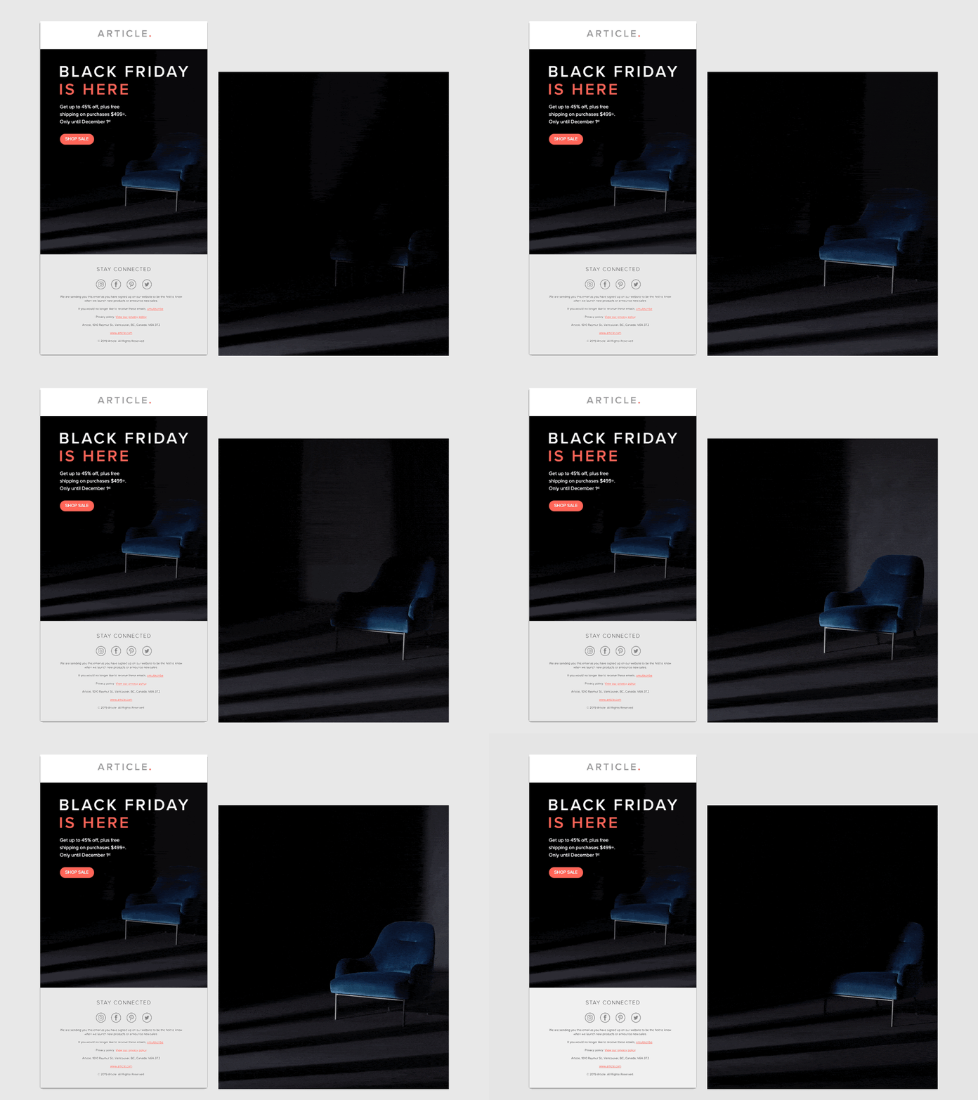
This animated background from furniture brand Article doesn't utilize bright and bold colors like some of the examples above. Instead, they use a dark animation that only shows enough of the featured armchair to pique subscribers' interest.

Article's campaign — and the background image that powers it. See the full email in Really Good Emails.
Why does this work so well? The human brain is wired to wanting to complete shapes—and if you don't have all the pieces that it takes to complete the image, it's only natural that your eye gets drawn to any additional info that could help you put the missing pieces together.
In this email, the reader might not be able to recognize the full shape of the chair in the first few seconds of viewing the email. The result: They will view the animation for a little longer, following the natural drive to get a full grasp of the object. These extra few seconds might be just what it takes to encourage the click.
Do you have a great idea in mind that utilizes an animated background but aren't quite sure how to get started with building it? We asked our friend and fellow #emailgeek Jay Oram how he'd tackle adding an animated background to an email, and here's what he said. Over to you, Jay!
Jay Oram is an Email Coder & Interactive email specialist at ActionRocket with years of experience in translating great designs and creative ideas into email HTML. You should connect with him on Twitter @emailjay —or say hi on the #emailgeeks Slack.
If all you're looking for is copy-and-paste ready HTML code for your animated background, jump straight to the CodePen. Or, read on for a deep dive into the code that powers animated backgrounds.
Before we dive into animated backgrounds, it's key to understand how background images in email work in general. There are a lot of great blog posts about the code you need for a background image, like this one that covers it really in detail.
But at the most basic level, to set up a background image that works across email clients you need to create a containing table—and then set the background image attributes and inline styling on the first <td>. Anything you then put inside that cell sits on top of the background image.
The table cell that holds all the content will need a few tweaks:
<td bgcolor="#000000" background="YourImageURL" width="640" height="400" style="background: url('YourImageURL') center / cover no-repeat #000000; background-position: center; background-size: cover; background-repeat: no-repeat;">
Some of this looks repetitive, you say? You're absolutely right. But we're offering our background image instructions in a few different ways to ensure that as many email clients as possible will understand them. Let's break it down:
The HTML attributes bgcolor, background, width, and height are all there to cover email clients that don't support the inline CSS styling. Adding the width and height as HTML attributes will also give a hint to the browser or email client about the gap to leave for your content.
Next, let's look at the inline CSS: The shorthand all wrapped up in a background tag adds support for webkit email clients and webmail, as well as the Gmail app with non-gmail accounts, as found by Justin Khoo over at Fresh Inbox.
background: url('https://via.placeholder.com/640x400') center / cover no-repeat #000000;
Lastly, we're adding the same information again, but in long form to add more control over Yahoo and AOL apps' backgrounds.
background-position: center; background-size: cover; background-repeat: no-repeat;
And finally, we'll need VML to make the background image work in Outlook for Windows Desktop apps. Outlook still uses the Word rendering engine to render email designs, and VML (Vector Markup Language) is the language that controls shapes, colors, and image layers behind text in this environment.
We won't go into the details of VML here but highlight the key element you must keep an eye on when using background imagery. Always ensure that you're using the same image link in the src="" field. Plus, for the size to be correct across all Outlook clients and Windows 10, you'll have to convert the pixel size (px) to points (pt).
To get points values, just multiply your pixel value by 0.75. For example, 640(px) x 0.75 = 480(pt).
<!--[if gte mso 9]>
<v:image xmlns:v="urn:schemas-microsoft-com:vml" fill="true" stroke="false" src="https://via.placeholder.com/640x400"></v:image> <v:rect xmlns:v="urn:schemas-microsoft-com:vml" fill="true" stroke="false" style=" border: 0;display: inline-block;position: absolute; width: 480pt; height:300pt;">
<v:fill opacity="0%" color="#ffffff" />
<v:textbox inset="0,0,0,0">
<![endif]-->
After these tags, add your content in its own enclosed table and then close all the above tags:
<!--[if gte mso 9]>
 </v:textbox>
 </v:rect>
<![endif]-->
</td>
So now we've got a background image set up—but how do you get it to animate?
The answer to it is simple: Rather than using a static image to fill your table cell, you just drop in an animated GIF!
Your code will remain the same, but you'll have to be aware of a few additional limitations when it comes to email client support.
The code above guarantees background image support across all major email clients. (A comprehensive list of support can be found here.) To find out what email clients support animated backgrounds, you'll have to take a look at what email clients also support GIFs. If there's overlap—and an email client supports both background images and animated GIFs—users of these clients will be able to see animated backgrounds.
As you see, animated backgrounds are supported in many of the most popular email clients. There's a few limitations thought that you should be aware of:
It is important to set a suitable background colour on the table cell and in the styling. That way, if your image doesn't work—be it because of a broken link, a slow loading image, or missing email client support—the content on top of it will still be visible. Choose your background color based on the content you've layered on top of it. For example, if you have white text over your background image, make sure to set a dark colour as a fallback.
The image size of your background image—that's the width and height—can be anything, but it's crucial that you keep your file size as low as possible. If your animated GIF contains much detail and many frames, your file can get large quite quickly. We've seen GIFs as big as 8MB in some emails—and that really impacts the email's load time, especially when you've got a slow internet connection. Even the most beautiful animation can't make an impact if they won't load for your subscribers, so we recommend keeping all GIFs under 2MB in file size.
If you're looking for tips on how to compress your animated GIFs to optimize them for your emails, check out these 10 tips for optimizing GIF file sizes for email.
If you're using Taxi for Email to create your emails, you can make it really easy for your team to add background imagery—without having your marketing team to touch any code.
This article shows you how to add a background image module with Taxi Syntax—and it works for both static images and animated backgrounds. Plus, if you'd like to set a maximum file size for all imagery to make sure that no campaign your team sends ever suffers from bloated images and long load times, you can do that in Taxi, too. Do you need any help getting your background images in Taxi to work? We're here to help!
Whether it's a campaign featuring an animated background or something else, the team at ActionRocket is here to support you along the way, from email strategy to design and development. Learn more.
Taxi helps marketing teams make better quality email, quicker, at a larger scale.